WP 6.1 Font size scale
This test post was generated using the block theme Emptytheme in WordPress 6.1.1.
Small H2 Heading
Medium H2 Heading
Large H2 Heading
Extra Large H2 Heading
Small paragraph
Medium paragraph
Large paragraph
Extra Large paragraph
WP 6.1 Media category blocks
This test post was generated using the block theme Emptytheme in WordPress 6.1.1.
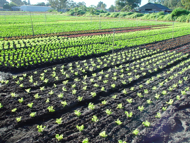
Image block:
Gallery:
Audio:
Cover:
Write title…
Fixed background
Repeated background
Fixed and Repeated background
Duotone

Top left
Top center
Top right
Center left
Center right
Bottom left
Bottom center
Bottom right
This is the Media & Text block with an image on the left.
This is the Media & Text block with a cropped image on the left
This is the Media & Text block with a video the right.
Block: Cover
This is a left aligned cover block with a background image.
The cover block lets you add text on top of images or videos.
This blocktype has several alignment options, and you can also align or center the text inside the block.
The background image can be fixed and you can change its opacity and add an overlay color.
Make sure that the text wraps correctly over the image, and that text markup and alignments are working.
The next image should have a pink overlay color, the text should be bold and aligned to the left:
A center aligned cover image block, with a left aligned text.
This is a full width cover block with a fixed background image with a 20% opacity.
Make sure that all the text is readable.
Our last cover image block has a wide width.
This is a wide cover block with a video background.
Compare the video and image blocks.
This block is centered.
The block below has no alignment, and the text is a link. Overlay colors must also work with video backgrounds.
Block: Columns
This page tests how the theme displays the columns block. The first block tests a two column block with paragraphs.
This is the second column. It should align next to the first column. Reduce the browser window width to test the responsiveness.
This is the second column block. It has 3 columns.
Paragraph 2 is in the middle.
Paragraph 3 is in the last column.
The third column block has 4 columns. Make sure that all the text is visible and that it is not cut off.
Now the columns are getting narrower.
The margins between the columns should be wide enough,
so that the content of the columns does not run into or overlap each other.
Column one.
Column two.
Column three.
Column four.
Column five.
To change the number of columns, select the column block to open the settings panel. You can show up to 6 columns. If the theme has support for wide align, you can also set the alignments to wide and full width.
Below is a column block with six columns, and no alignment:
Column one.
Column two.
Column three.
Column four.
Column five.
Column six.
Next is a 3 column block, with a wide alignment:
Column one.
Column two.
Column three.
And here is a two column block with full width, and a longer text. Make sure that the text wraps correctly.
This is column one. Sometimes, you may want to use columns to display a larger text, so, lets add some more words. Lorem ipsum dolor sit amet, consectetuer adipiscing elit. Donec mollis. Quisque convallis libero in sapien pharetra tincidunt. Aliquam elit ante, malesuada id, tempor eu, gravida id, odio. Maecenas suscipit, risus et eleifend imperdiet, nisi orci ullamcorper massa, et adipiscing orci velit quis magna. Praesent sit amet ligula id orci venenatis auctor. Phasellus porttitor, metus non tincidunt dapibus, orci pede pretium neque, sit amet adipiscing ipsum lectus et libero. Aenean bibendum. Curabitur mattis quam id urna. Vivamus dui. Donec nonummy lacinia lorem. Cras risus arcu, sodales ac, ultrices ac, mollis quis, justo. Sed a libero. Quisque risus erat, posuere at, tristique non, lacinia quis, eros.
Column two. Cras volutpat, lacus quis semper pharetra, nisi enim dignissim est, et sollicitudin quam ipsum vel mi. Sed commodo urna ac urna. Nullam eu tortor. Curabitur sodales scelerisque magna. Donec ultricies tristique pede. Nullam libero. Nam sollicitudin felis vel metus. Nullam posuere molestie metus. Nullam molestie, nunc id suscipit rhoncus, felis mi vulputate lacus, a ultrices tortor dolor eget augue. Aenean ultricies felis ut turpis. Lorem ipsum dolor sit amet, consectetuer adipiscing elit. Suspendisse placerat tellus ac nulla. Proin adipiscing sem ac risus. Maecenas nisi. Cras semper.
We can also add blocks inside columns:
- This is a numbered list,
- inside a 3 column block
- with a wide alignment.
The middle column has a paragraph with an image block below.
-This third column has a quote
Theme Reviewer
But wait there is more! We also have a block called Media & Text, which is a two column block that helps you display media and text content next to each other, without having to first setup a column block:
Media & Text
A paragraph block sits ready to be used, below your headline.
Block category: Common
The Common category includes the following blocks: Paragraph, image, headings, list, gallery, quote, audio, cover, video.
The paragraph block is the default block type. It should not have any alignment of any kind. It should just flow like you would normally expect. Nothing fancy. Just straight up text, free flowing, with love.
This paragraph is left aligned.
This italic paragraph is right aligned.
Neither of these paragraphs care about politics, but this one is bold, medium sized and has a drop cap.
This paragraph is centered.
This paragraph prefers Jazz over Justin Timberlake. It also uses the small font size.
This paragraph has something important to say: It has a large font size, which defaults to 36px.
The huge text size defaults to 46px, but the size can be customized.
This paragraph is colorful, with a red background and white text (maybe). Colored blocks should have a high enough contrast, so that the text is readable.
Below this block, you will see a single image with a circle mask applied.
H1 Heading
H2 Heading
H3 Heading
H4 Heading
H5 Heading
H6 Heading
Ordered list
- The software should be licensed under the GNU Public License.
- The software should be freely available to anyone to use for any purpose, and without permission.
- The software should be open to modifications.
- Any modifications should be freely distributable at no cost and without permission from its creators.
- The software should provide a framework for translation to make it globally accessible to speakers of all languages.
- The software should provide a framework for extensions so modifications and enhancements can be made without modifying core code
Unordered list
- One
- Two
- Three
- Four
- Five
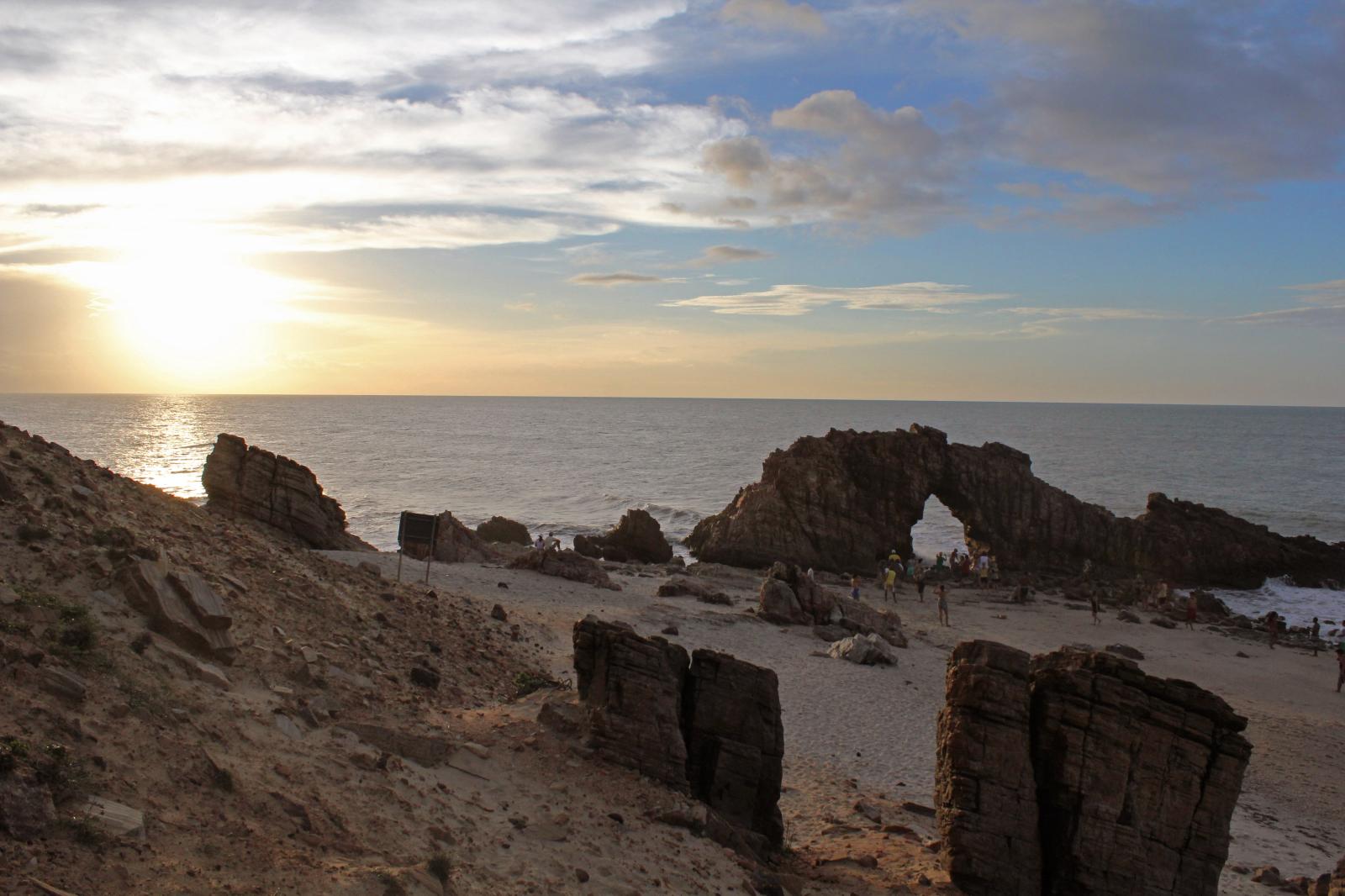
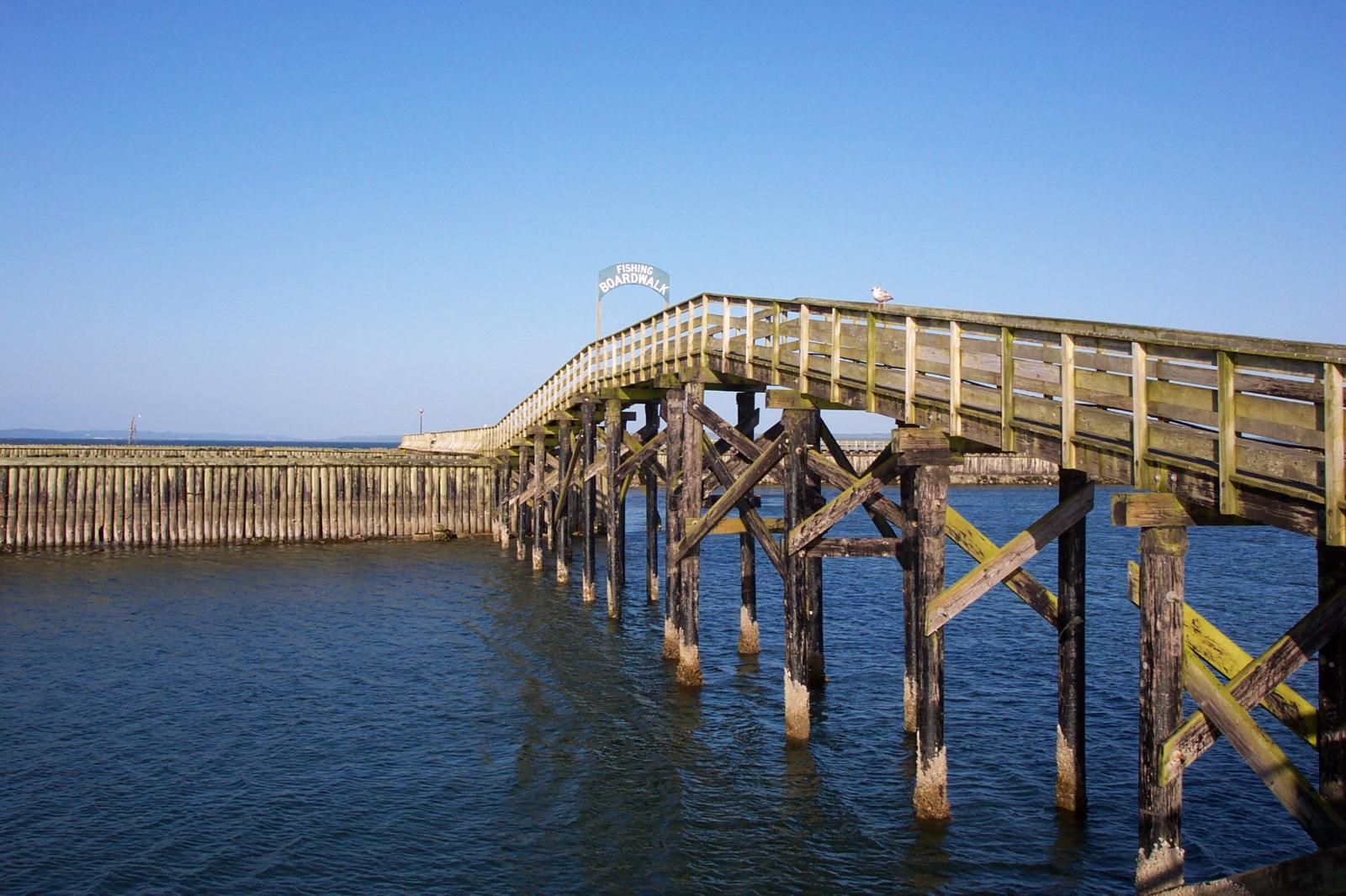
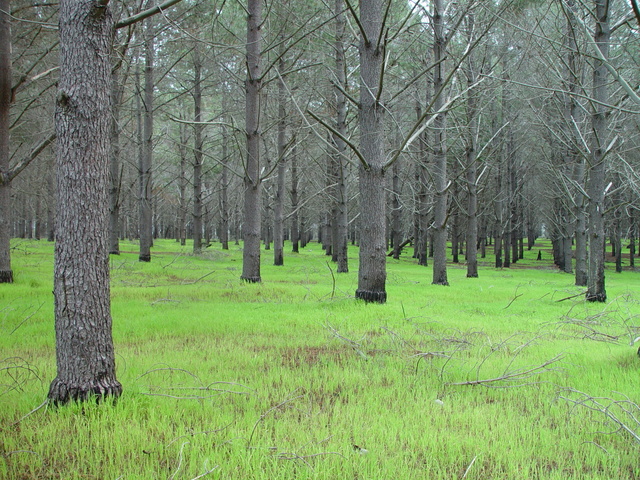
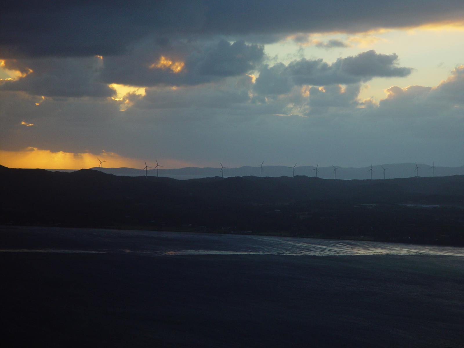
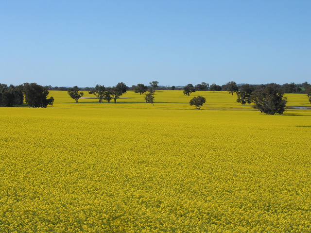
Jericoacoara Ceara Brasil 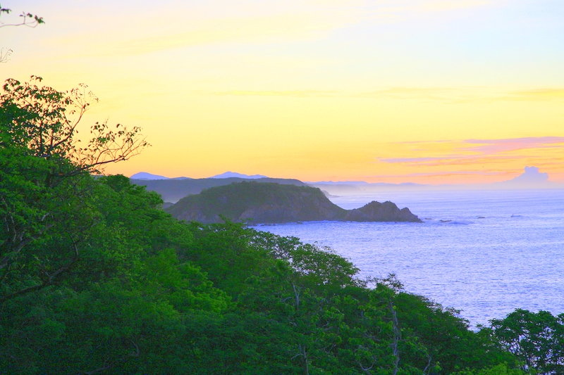
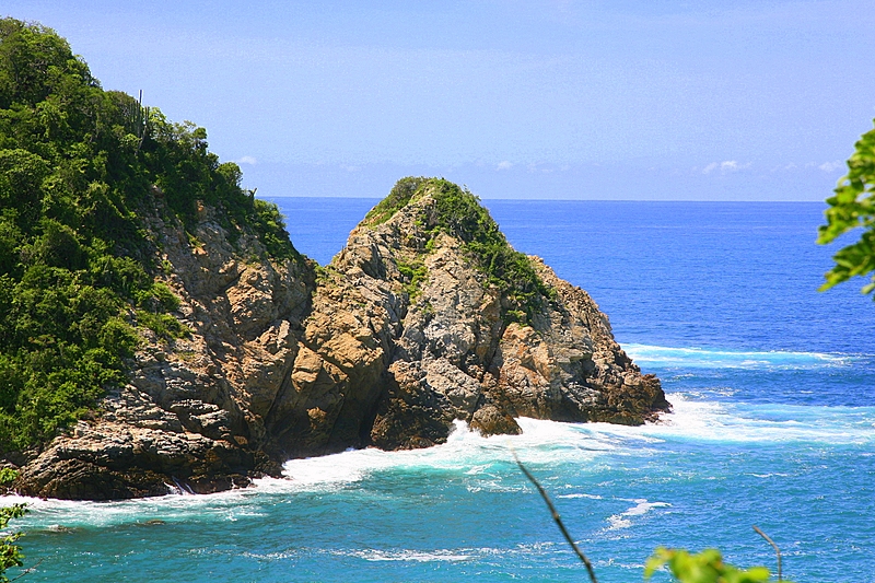
Sunrise over the coast in Huatulco, Oaxaca, Mexico 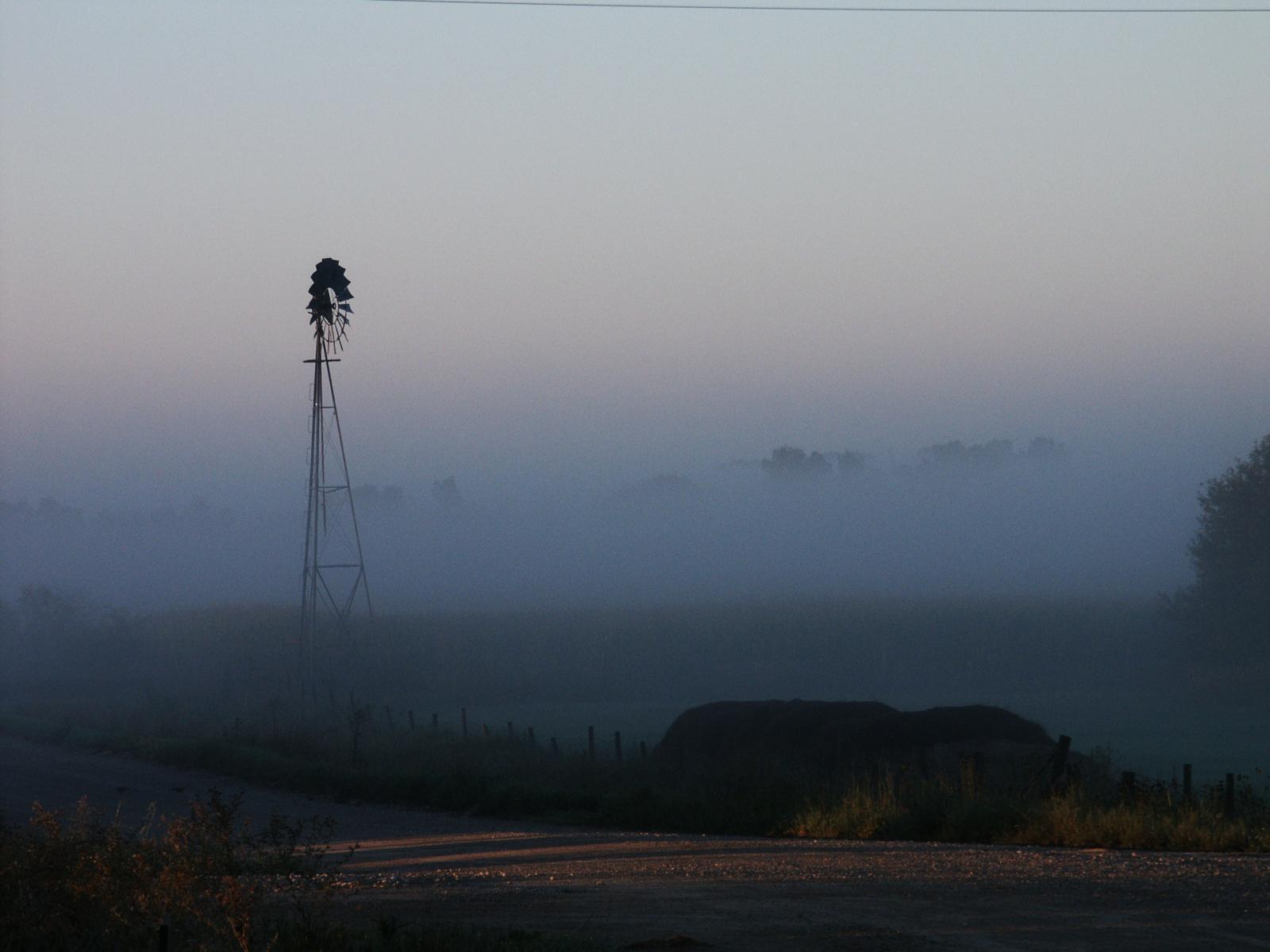
Windmill shrouded in fog at a farm outside of Walker, Iowa Coastline in Huatulco, Oaxaca, Mexico 
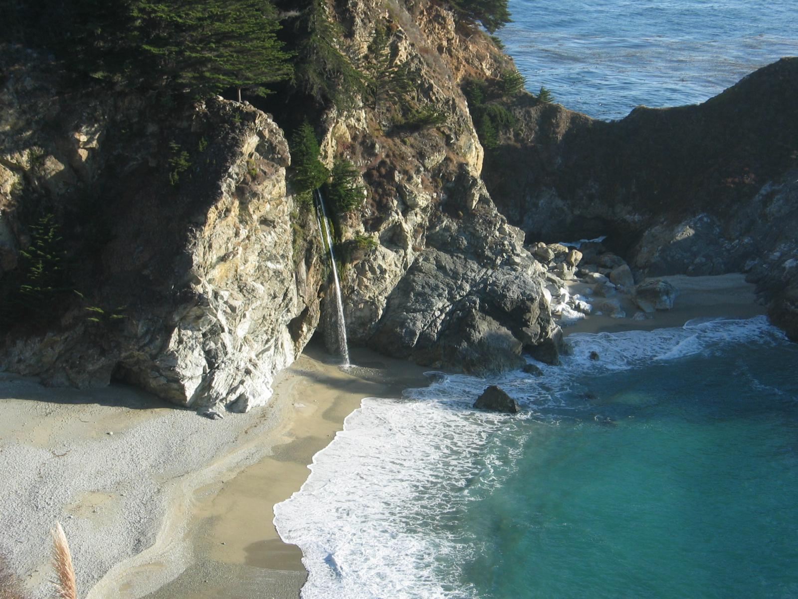
Beach at Big Sur, CA
Quote
Cite
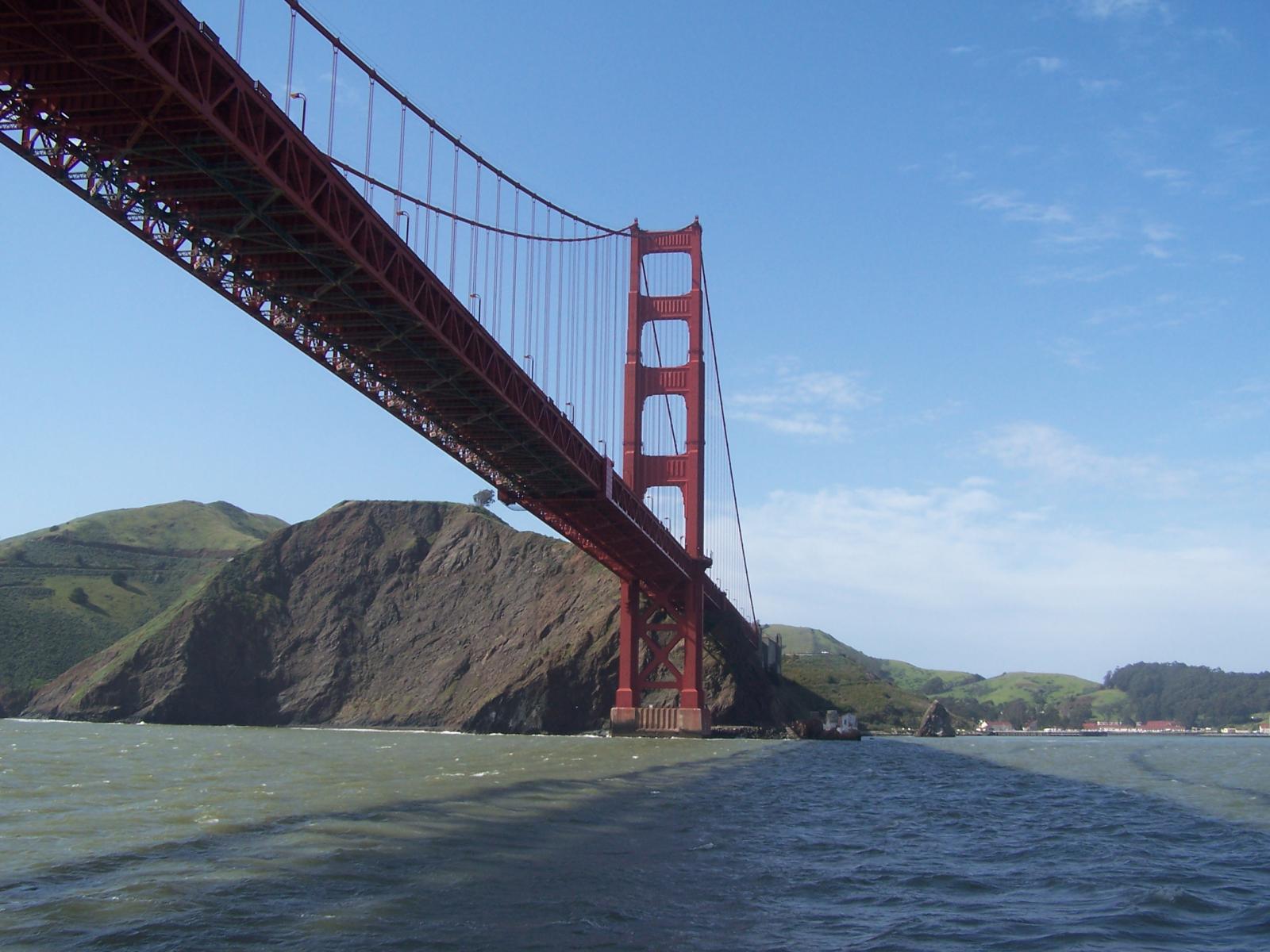
Cover block with background image
The file block has a setting that lets us show or hide a download button with editable text:
Video blocks have settings for showing and hiding the playback controls. Use autoplay and playback controls responsibly.
The video block below is muted and has a poster image that displays before the video starts:
Markup: Title With Special Characters ~`!@#$%^&*()-_=+{}[]/\;:'”?,.>
Putting special characters in the title should have no adverse effect on the layout or functionality.
Special characters in the post title have been known to cause issues with JavaScript when it is minified, especially in the admin when editing the post itself (ie. issues with metaboxes, media upload, etc.).
Latin Character Tests
This is a test to see if the fonts used in this theme support basic Latin characters.
| ! | „ | # | $ | % | & | ’ | ( | ) | * |
| + | , | – | . | / | 0 | 1 | 2 | 3 | 4 |
| 5 | 6 | 7 | 8 | 9 | : | ; | > | = | < |
| ? | @ | A | B | C | D | E | F | G | H |
| I | J | K | L | M | N | O | P | Q | R |
| S | T | U | V | W | X | Y | Z | [ | \ |
| ] | ^ | _ | ` | a | b | c | d | e | f |
| g | h | i | j | k | l | m | n | o | p |
| q | r | s | t | u | v | w | x | y | z |
| { | | | } | ~ |
Template: Excerpt (Generated)
This is the post content. It should be displayed in place of the auto-generated excerpt in single-page views. Archive-index pages should display an auto-generated excerpt of this content. Depending on Theme-defined filters, the length of the auto-generated excerpt will vary from Theme-to-Theme. The default length for auto-generated excerpts is 55 words, so to test the excerpt auto-generation, this post must have more than 55 words.
Be sure to test the formatting of the auto-generated excerpt, to ensure that it doesn’t create any layout problems. Also, ensure that any filters applied to the excerpt, such as excerpt_length and excerpt_more, display properly.